# Viewing Binders
Binders consist of sections and documents. Sections provide a method of creating and organizing a hierarchy for the binder's content. When viewing a binder, users can see the sections and documents that form the binder structure. A number appears in parentheses after each binder section to indicate how many documents link into that section and its subsections. Within a section, click on a document name to view the Doc Info page or hover over the document name to see available actions.
## Binder Layout Options {#views}
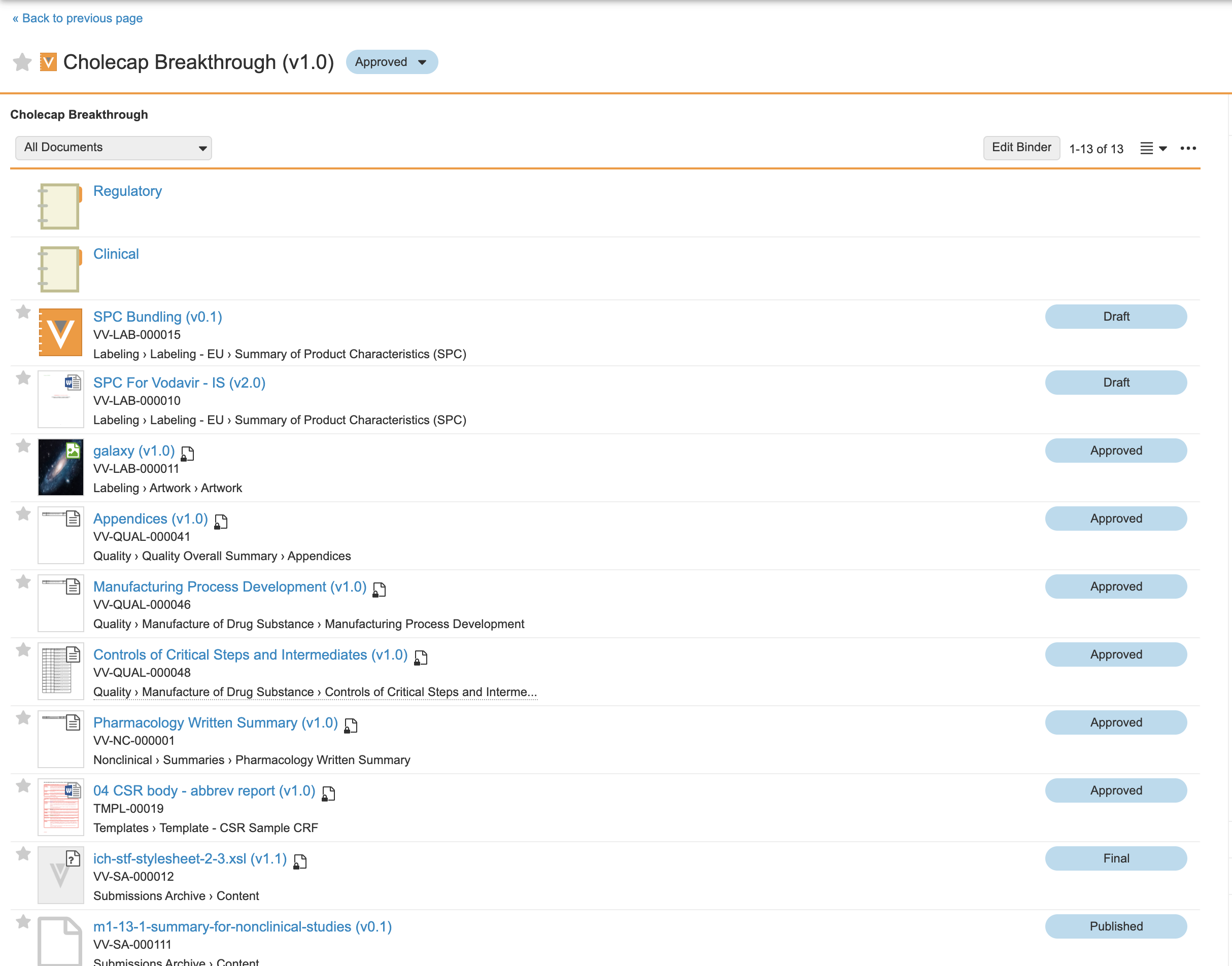
Binders can display in **Compact View** or **Outline View**. If you leave the binder page and return later, Vault preserves your last layout selection. Use the toolbar to switch between these options. When switching, Vault remembers which section you are viewing.
## Binder Actions {#actions}
Users with **Edit Document** access see the **Edit Binder** button enabled when viewing a binder. Click to enter edit mode
. When you enter edit mode, Vault remembers your location in the binder structure.
## Filtering
The **Show** menu allows you to filter the documents that appear in both compact and outline views. Select an option (Unbound documents, etc.) to show and Vault immediately updates the view below.
## Multi-Document Viewer
In the multi-document viewer, you can view all documents in a binder or section simultaneously. To view every document in the binder, select **All Documents** from the binder's **Actions** menu. To view all documents in one section, including component sections, select **All Documents** from the section's **Actions** menu. To view all documents in a section, not including component sections, select **All Documents in Section**. You can also perform bulk actions on the documents visible in the multi-document viewer.
## Navigating in Compact View {#list}
The image below shows the binder in **Compact View**. From this view, hovering over a section highlights it and clicking on the section name opens that binder section.
 ### Breadcrumbs {#breadcrumbs}
When viewing a binder section, the breadcrumb trail allows you to return to a higher level in the binder structure by clicking the links.
### Paging Controls {#paging}
The paging controls allow you to control how many documents to view at a time. This can be particularly helpful when there are many documents linked into one section.
## Navigating in Outline View {#outline}
The image below shows the initial view of a binder in **Outline View**. Click the **Expand All** or **Collapse All** links to expand or collapse all sections and subsections. Click the arrow icons next to each section to show the contents.
### Breadcrumbs {#breadcrumbs}
When viewing a binder section, the breadcrumb trail allows you to return to a higher level in the binder structure by clicking the links.
### Paging Controls {#paging}
The paging controls allow you to control how many documents to view at a time. This can be particularly helpful when there are many documents linked into one section.
## Navigating in Outline View {#outline}
The image below shows the initial view of a binder in **Outline View**. Click the **Expand All** or **Collapse All** links to expand or collapse all sections and subsections. Click the arrow icons next to each section to show the contents.
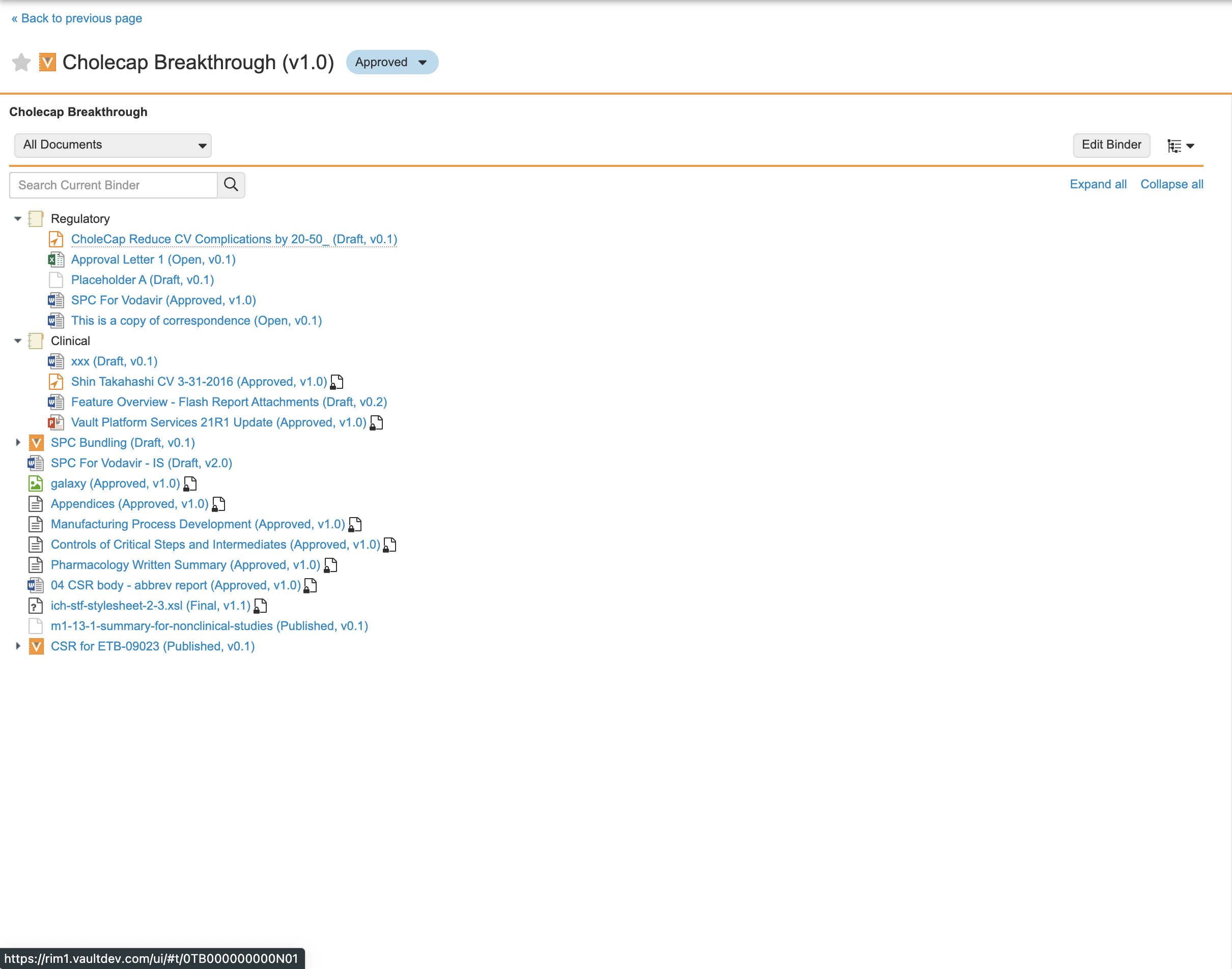 If the binder includes component binders, the **Expand All** action does not expand these. To see sections and documents inside a component binder, use the arrow icons. If the binder contains over 4,000 documents, you cannot expand it, and clicking the **Expand All** link triggers an error message.
### Search {#search}
You can also search the outline for specific text. Within an outline, Vault searches the section and document names and numbers, but not document content or other fields. To execute a search, enter the search term and press **Enter**. A search results page will show matching terms in **bold**. To clear the search, click the **X** icon in the search box.
Searches do not include documents inside component binders.
### Keyboard Shortcuts {#keyboard}
The following keyboard shortcuts are available when working in **Outline View**.
|Shortcut|Action|
|--- |--- |
|Up/Down Arrows (**↑ ↓**)|Move up and down through the binder|
|Right Arrow (**→**)|Expand the currently highlighted section|
|Left Arrow (**←**)|Collapse the currently highlighted section|
|Enter / Return|If the highlight is currently on a section, this expands and selects the section. If the highlight is currently on a document, this opens the Doc Info page for the selected document.|
## Navigating Component Binders
In Vault, you can add a component binder to another binder. When viewing a binder in outline view, you can use the arrow icons to expand component binders and their sections, allowing you to see the documents included and perform actions on those documents. Sections that belong to a component binder have a grey icon, rather than the standard section icon. Note that this option is not available in edit mode.
Clicking on the binder's name does not expand that binder, but instead opens the Doc Info page for the component binder. In compact view, it's not possible to drill into the component binder without exiting the binder you're currently viewing.
## Binder Library Icons {#binderthumbview}
When viewing binders in the Library, two standard thumbnail images distinguish binders from documents. Binder colors indicate the type of content for which the binder is used. Most binder types are orange. Presentation binders configured for CLM or Engage integration are black.
To make a binder more easily recognized in the Library, you can customize the binder icon with a thumbnail image from a document within the binder. To use custom binder thumbnails, an Admin must first enable **Binder Thumbnails** for the binder document type
. Once enabled, Vault selects the first document in the binder hierarchy as the thumbnail image. You can also manually select a document from within the binder to use as the thumbnail image
.
If the binder includes component binders, the **Expand All** action does not expand these. To see sections and documents inside a component binder, use the arrow icons. If the binder contains over 4,000 documents, you cannot expand it, and clicking the **Expand All** link triggers an error message.
### Search {#search}
You can also search the outline for specific text. Within an outline, Vault searches the section and document names and numbers, but not document content or other fields. To execute a search, enter the search term and press **Enter**. A search results page will show matching terms in **bold**. To clear the search, click the **X** icon in the search box.
Searches do not include documents inside component binders.
### Keyboard Shortcuts {#keyboard}
The following keyboard shortcuts are available when working in **Outline View**.
|Shortcut|Action|
|--- |--- |
|Up/Down Arrows (**↑ ↓**)|Move up and down through the binder|
|Right Arrow (**→**)|Expand the currently highlighted section|
|Left Arrow (**←**)|Collapse the currently highlighted section|
|Enter / Return|If the highlight is currently on a section, this expands and selects the section. If the highlight is currently on a document, this opens the Doc Info page for the selected document.|
## Navigating Component Binders
In Vault, you can add a component binder to another binder. When viewing a binder in outline view, you can use the arrow icons to expand component binders and their sections, allowing you to see the documents included and perform actions on those documents. Sections that belong to a component binder have a grey icon, rather than the standard section icon. Note that this option is not available in edit mode.
Clicking on the binder's name does not expand that binder, but instead opens the Doc Info page for the component binder. In compact view, it's not possible to drill into the component binder without exiting the binder you're currently viewing.
## Binder Library Icons {#binderthumbview}
When viewing binders in the Library, two standard thumbnail images distinguish binders from documents. Binder colors indicate the type of content for which the binder is used. Most binder types are orange. Presentation binders configured for CLM or Engage integration are black.
To make a binder more easily recognized in the Library, you can customize the binder icon with a thumbnail image from a document within the binder. To use custom binder thumbnails, an Admin must first enable **Binder Thumbnails** for the binder document type
. Once enabled, Vault selects the first document in the binder hierarchy as the thumbnail image. You can also manually select a document from within the binder to use as the thumbnail image
.